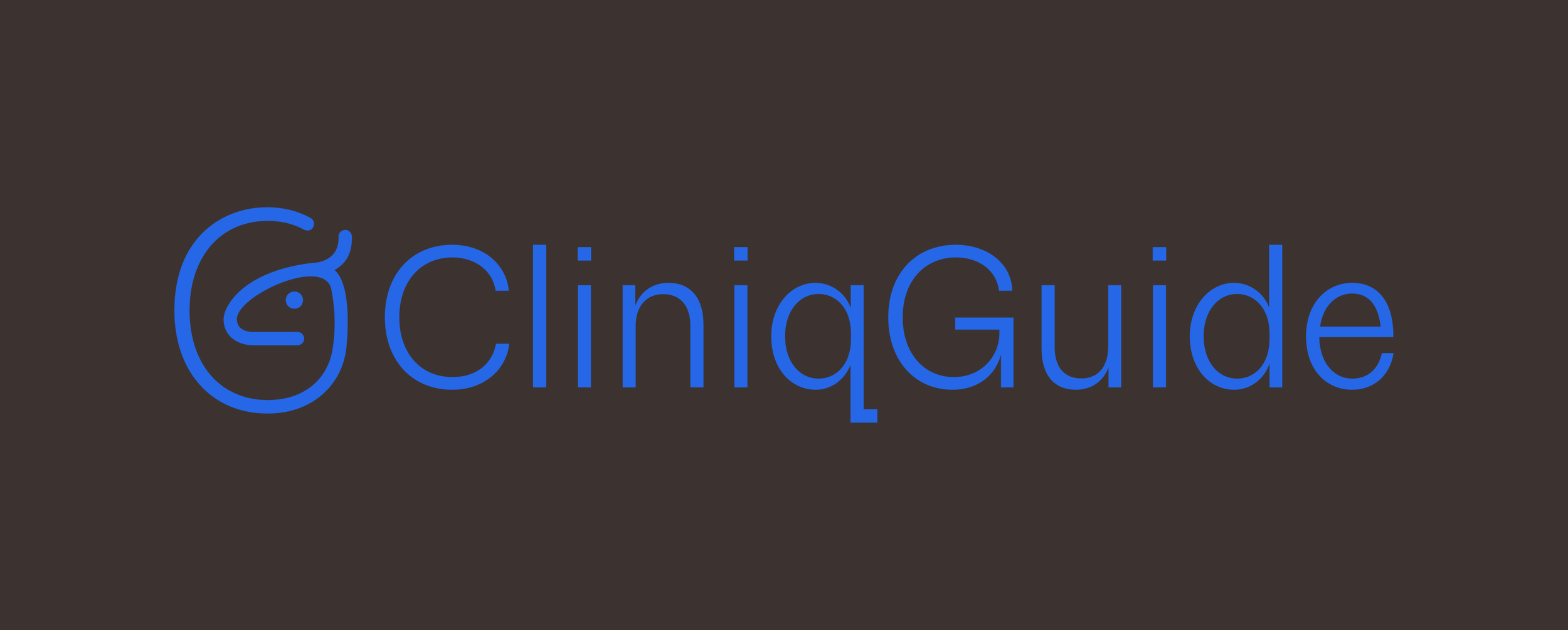
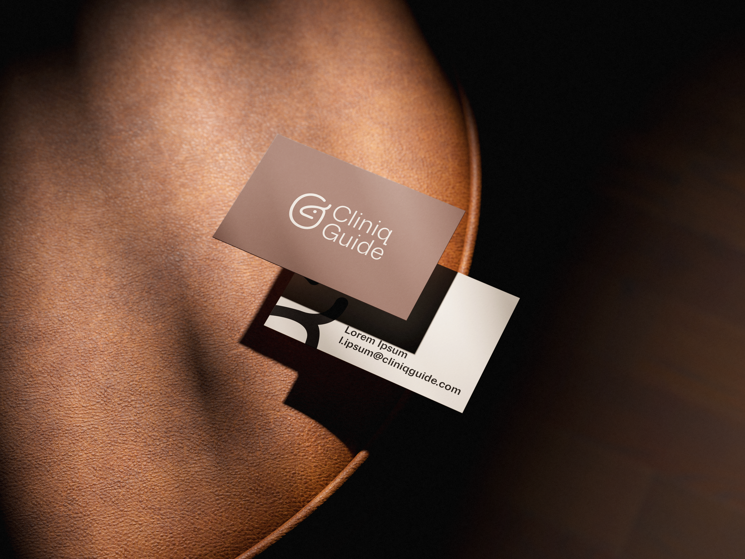
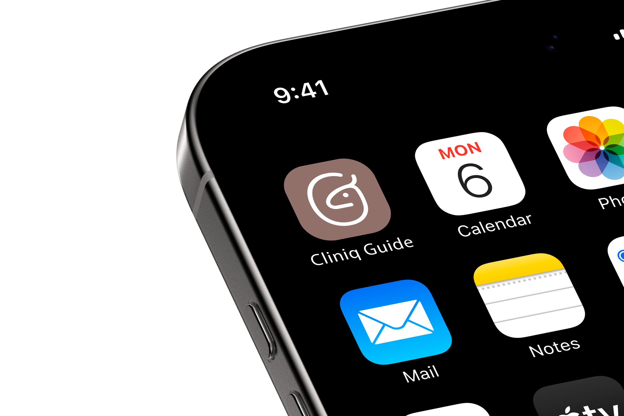
Cliniq Guide
Cliniq Guide tasked me with created their logo and brand identity. They are a medical treatment comparison platform focused on online clinics and prescription-based telehealth services. They help users compare options across categories such as weight loss ED, TRT, hair loss and hormone therapy.
There is a legitmate fear out there for people seeking online support that they are going to be misled or even scammed. CliniqGuide’s vision is to be the calming voice amongst the malaise of agressive comparison companies who try to take advantage of these vulnerable people. Ways in which this is achieved is through a transparent cost structure, better explanations of eligibility and processes, a more structured comparison format and no “top 10” gimmicks.
Before the creation phase of the project I set out to discover as much as I could about the business, this would help to guide my creative process. I wanted a logo that stood out from the overuse of fonts, greens and neutral colours that their competitors used. It also had to speak to their brand values:
Clarity
They understand that when people require their services they are most likely in a vulnerable health position, having this at the forefront ensures that they don’t beat around the bush. They provide quick but concise and considered advice to your customers.
Credibility
They let their credentials speak for themselves, when customers access their services they quickly realise that they are in the care of medical professionals.
Structured
A no nonsense approach to the way you operate, you are formal but accommodating to your customers - where you are always happy to oblige.
Calm Authority
By operating with a calm authority they provide reassurance to their customers that they are in the right place. They are able to advise and instruct their customers without being forceful or pushy, helping them to feel relaxed in the thought that they are receiving genuine advice without the motive of money. They can then make a decision with confidence.
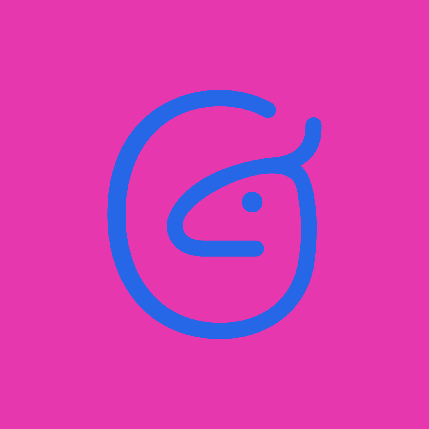
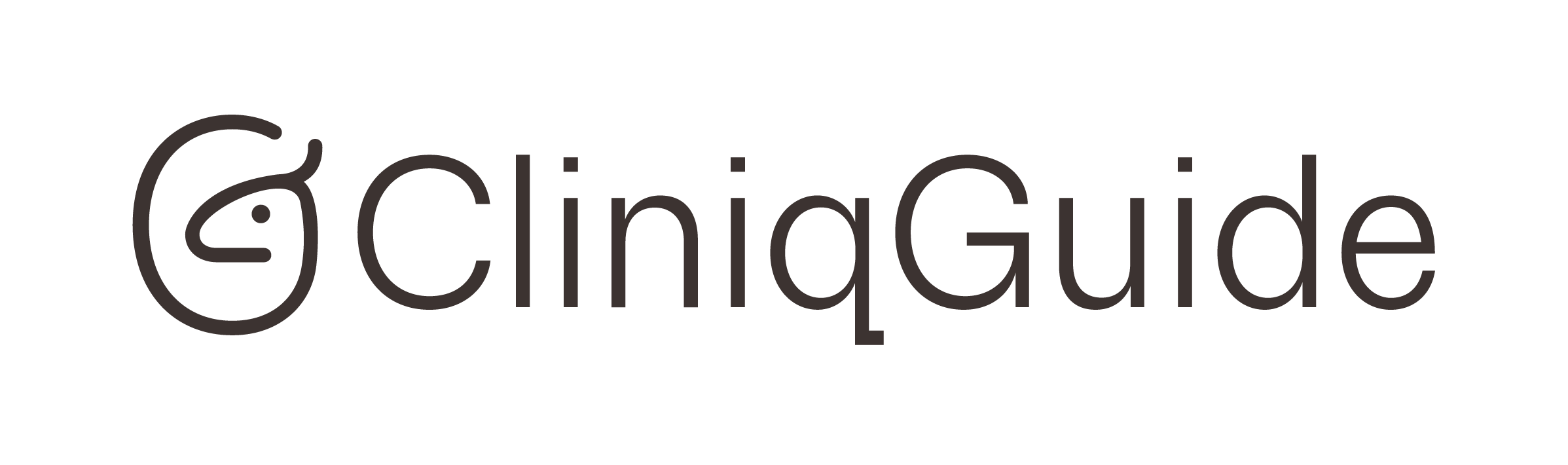
For this logo route I wanted to use a symbol which symbolised the core values of Cliniq Guide, which are clarity, integrity, transparency and responsibility. For this I chose the deer, an animal commonly associated with compassion, sensitivity and gentle nurture. An animal that can guide someone on their healing journey. I believe the feelings and symbolism of the deer tie in nicely with the vision of the brand. The icon of the deer has also been created using letter forms of “C” and “G”, which add a nice and own-able touch.